View my Tableau Public portfolio at https://public.tableau.com/profile/gaelan.smith.
See below for public samples of my Power BI portfolio.
Contact me for anonymized samples of work for clients,
predominately in Power BI.
predominately in Power BI.

Click on the image to see this in Tableau Public.
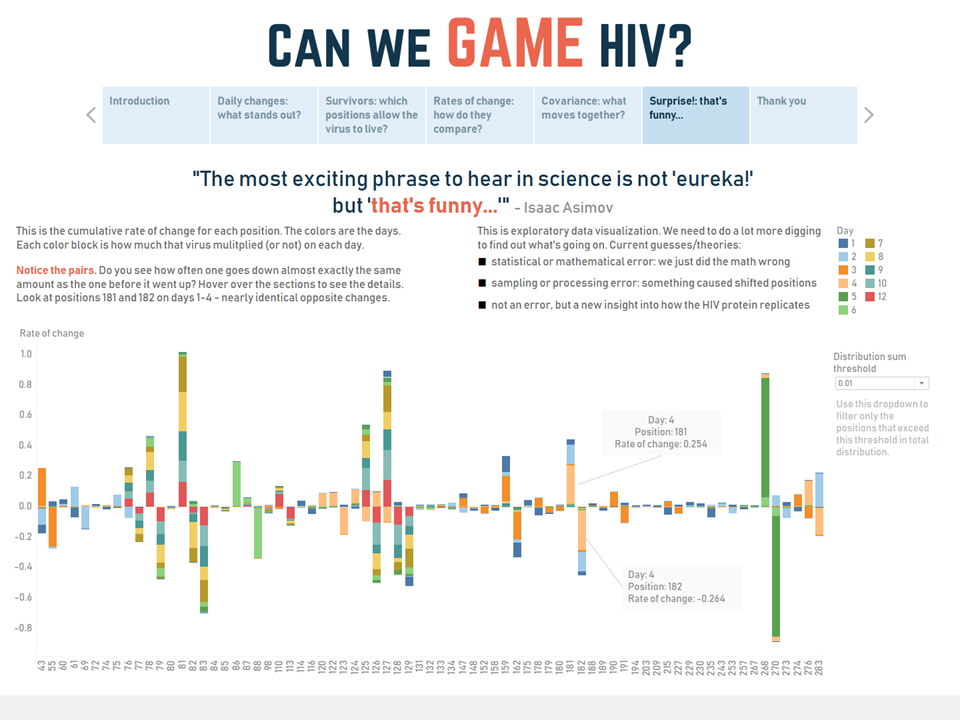
Dr. Erica Jacobs and her team at Rockefeller University made huge strides in understanding HIV, but they knew they could get more from their data. Using both published and unpublished data from their study, I reworked their initial charts, added animation and interactivity, and uncovered some new and potentially very important information hiding in the results.

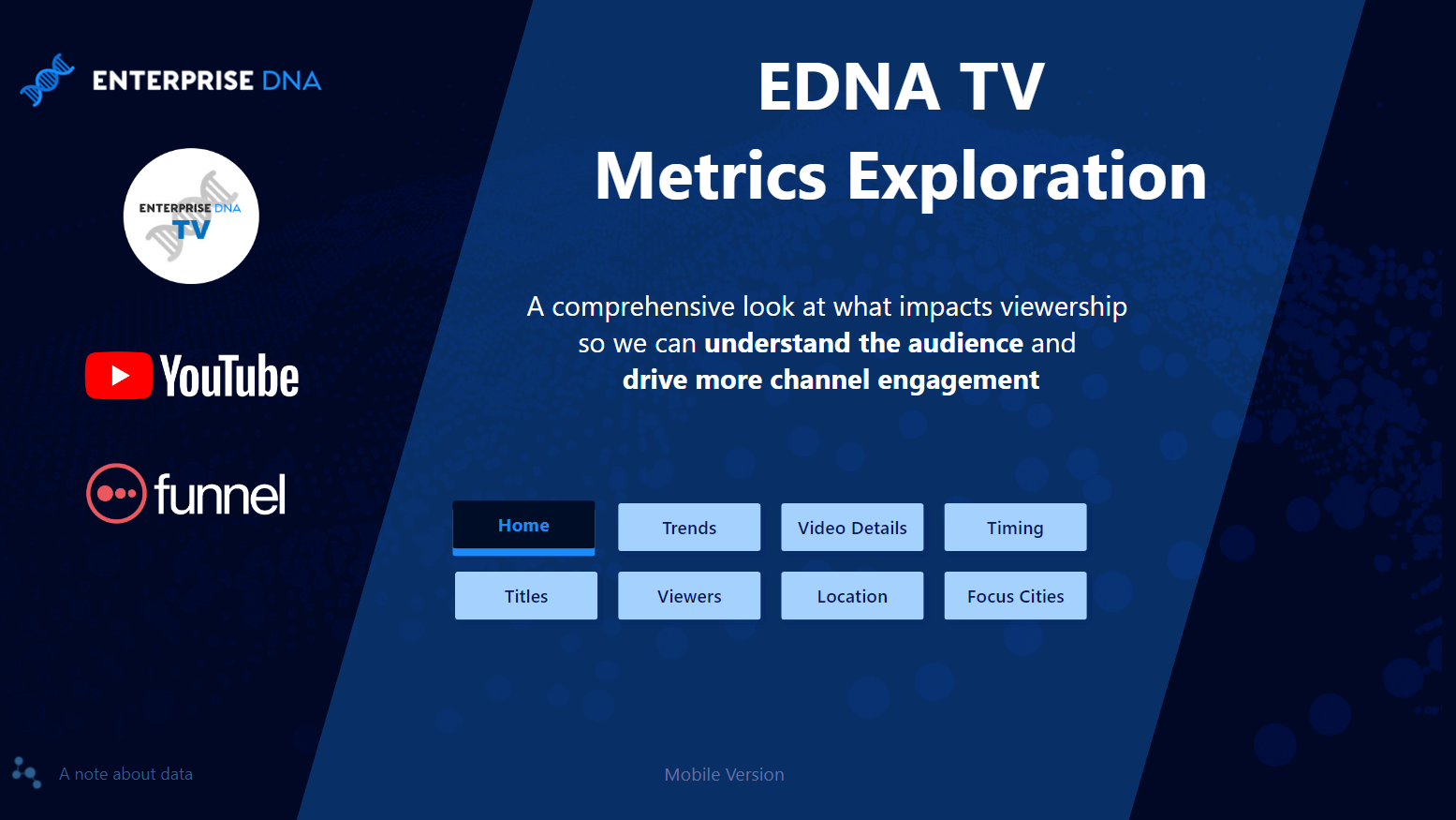
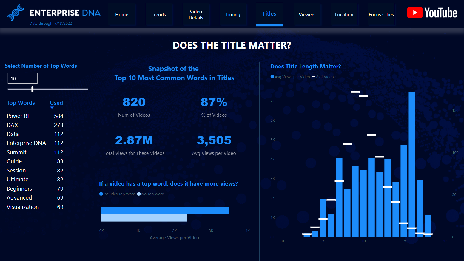
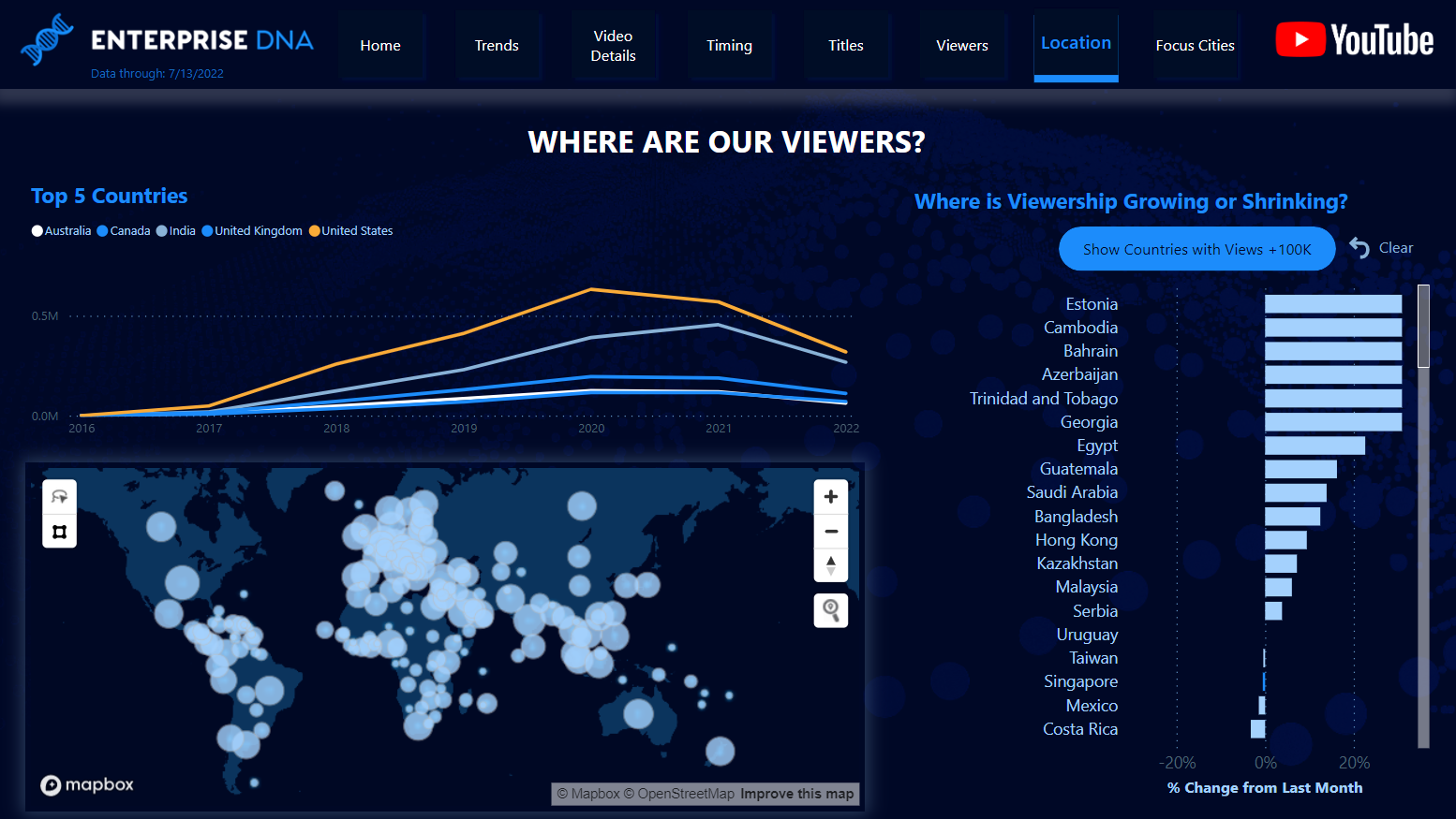
Winner, Enterprise DNA YouTube Analytics Dashboard Challenge
Click on this image to see and interact with the dashboard in Power BI.
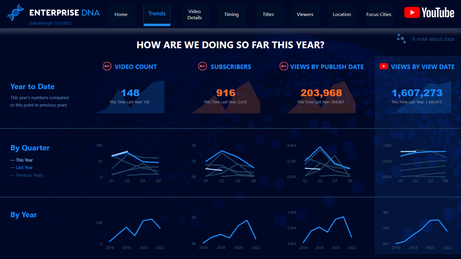
Trends
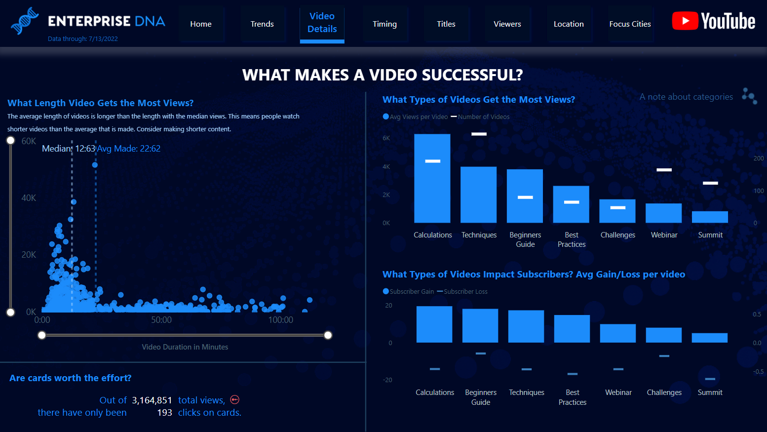
Video Details
Titles
Location
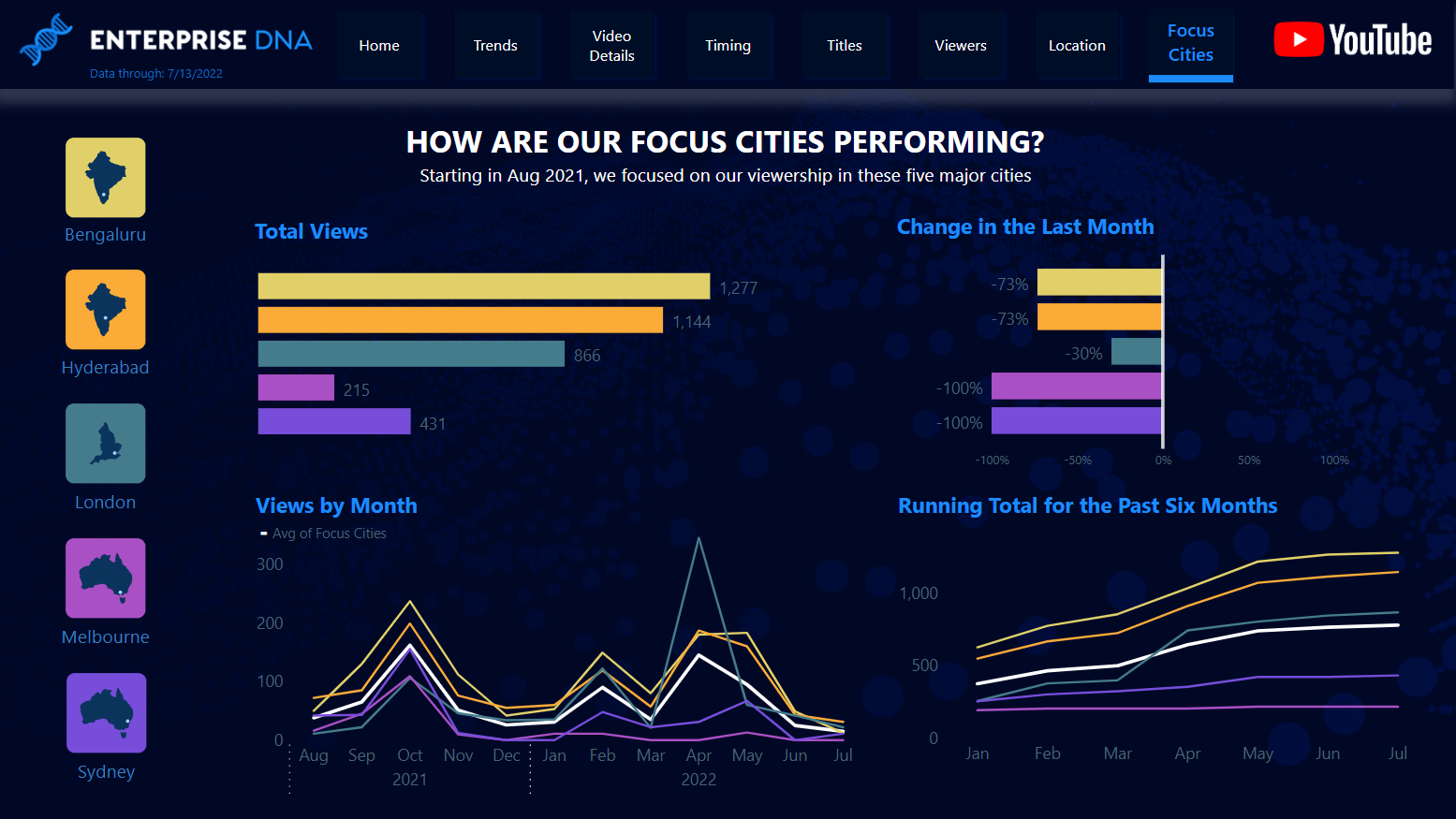
Focus Cities
Video is a major component for many brands, so going beyond surface metrics to determine what resonates most with customers is critical. Are your titles catching people's eyes? Is your video length turning people off? This dashboard analyzes the YouTube channel of the internationally acclaimed Power BI training site, Enterprise DNA and uncovers actionable areas to optimize their content.
Out of over 75 entrants, this dashboard was selected as one of the top four winners of the Enterprise DNA YouTube Analytics Dashboard Challenge. The founder & CEO gave special mention to my report and is already using the insights in their business practices. See an analysis from the judges that examines the details.

Click on the image to see and interact with this dashboard in Power BI.
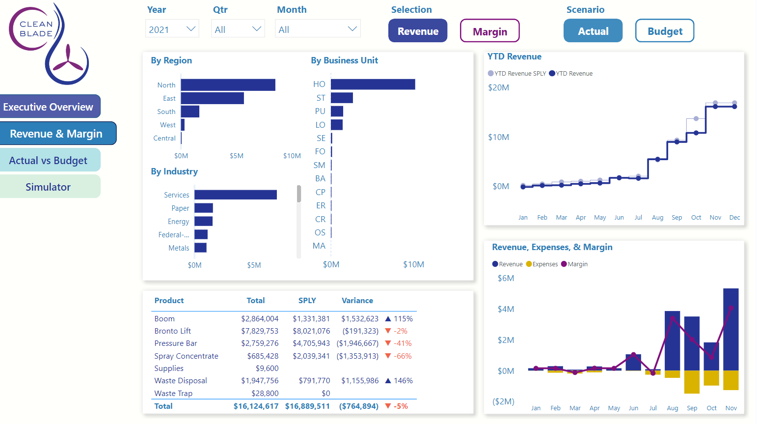
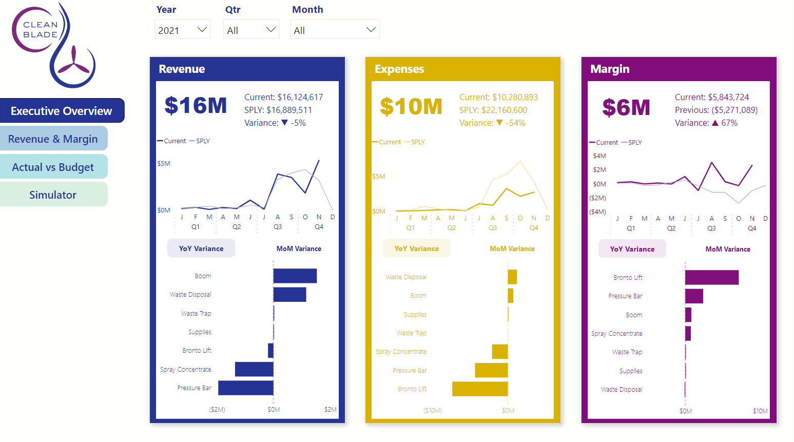
Revenue & Margin
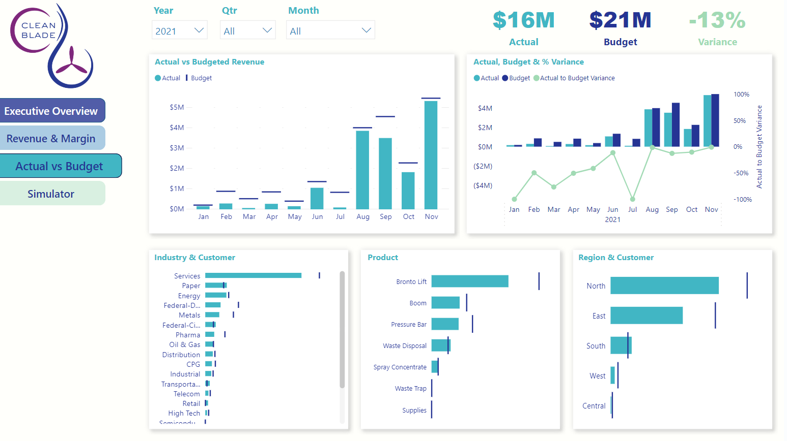
Actual vs Budget
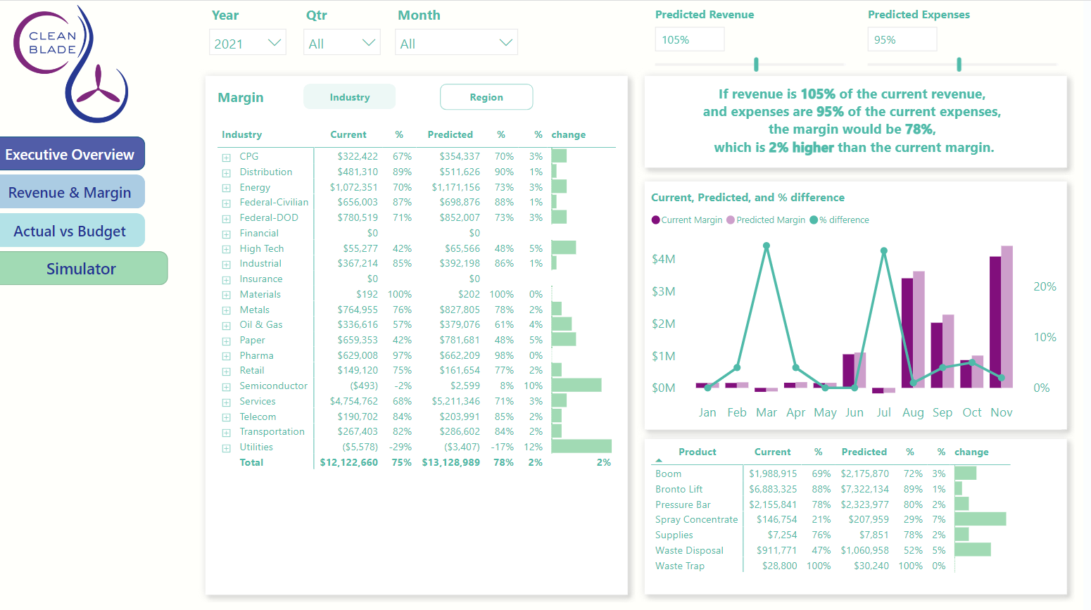
Simulator
Financial data, especially for sales, is a mainstay in data visualization. This executive report looks at revenue, expenses, and margins for a fictional company that cleans wind turbines. There is a significant amount of interactivity and is a tool for the executive team to reflect on the past, stay abreast of the current, and plan for the future.

Click on the image to see this in Tableau Public.
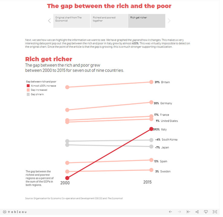
The Economist attempted to show that the gap between the rich and poor is growing, but their chart didn't show that. I reworked the data to show the story in a more accessible and compelling way. Now, you can see that the gap in Italy has grown almost 400% in 15 years.

Click on the image to see this in Tableau Public.
Click on the image to see this in Tableau Public.
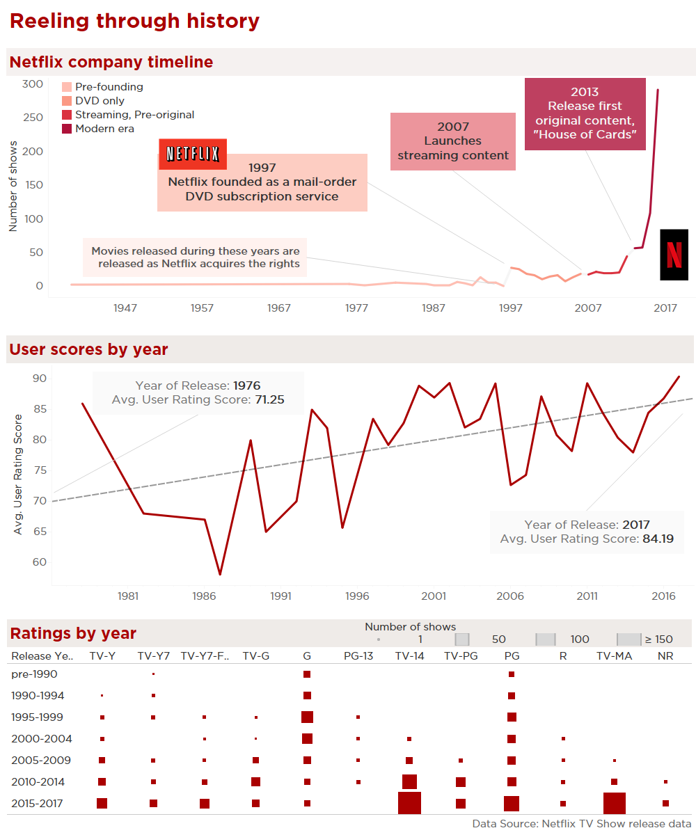
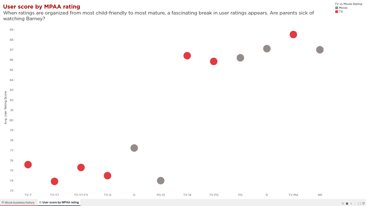
This dashboard looks at Netflix's history, and how users have scored movies by the original release date. I found a fascinating division in the data when I sorted by MPAA rating - the younger audience shows have a much lower rating. Perhaps parents are sick of Barney?

Infographic: Before and After
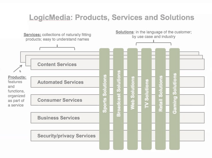
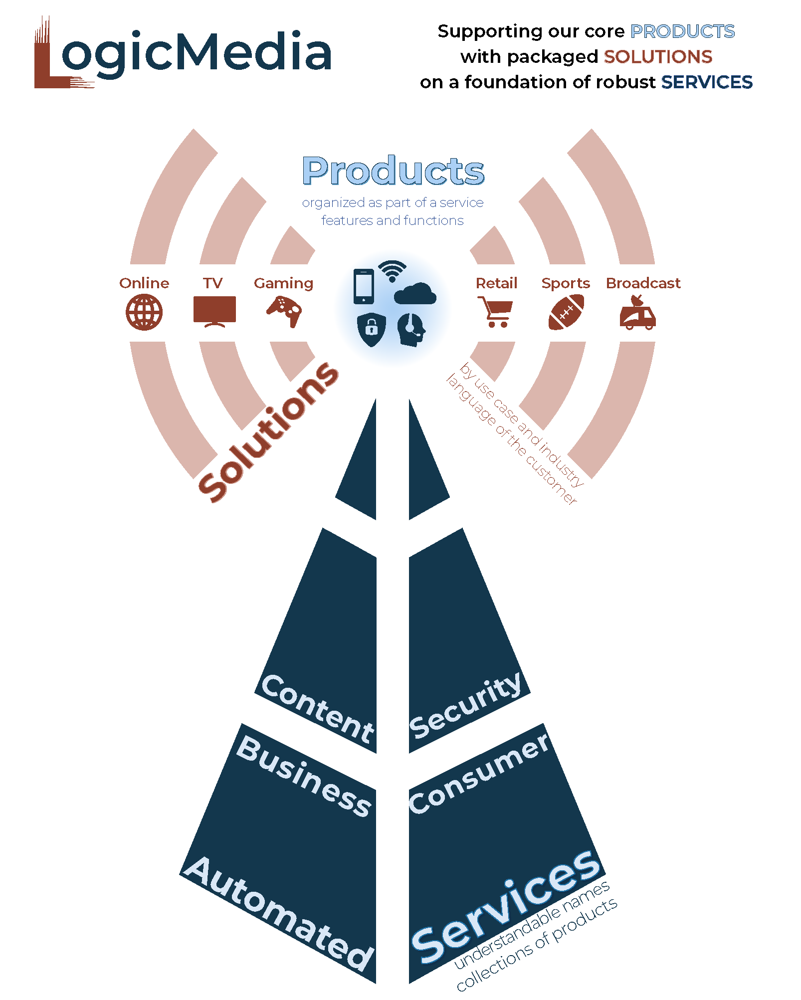
Numbers aren't the only form of information that needs good visualization. The original on the left was provided by the CEO of a major network provider to explain how the various parts of the company's subdivisions work together. The graphic on the right is my interpretation of the same information.

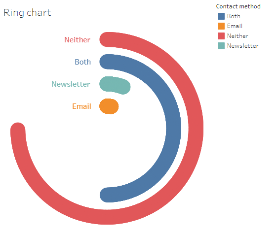
Click on the image to see this in Tableau Public.
Exploring new types of charts and layouts is fun - and critical part of growing skills. Here is an early example of learning what Tableau can do. See a tutorial I wrote on how to make this ring chart.
